see dtl’s ExquisiteFonts website!
| Home | Search | Site index | About | Contact |
The collection of the Dutch Type Library provides exclusive fonts for the development of, for example, corporate identities, and because of the extensive range of character sets also fonts for specialist book productions.
The most important contrast sorts based on the broad nib and flexible pointed pen, transitional forms, and sans serif are represented in the program of the Dutch Type Library. The graphic designer can therefore apply dtl’s collection of typefaces to solve all conceivable typographical cases.
Some dtl typefaces offer different versions for the large and small point sizes, and most fonts come in different weights. All fonts are, of course, available with old-style and tabular figures. In some cases, the small caps are accompanied by special custom (small) tabular figures. Beautiful ligature sets complete the range.
With its extensive character sets, the Dutch Type Library has been ahead of the development of Unicode-supporting fonts for more than three decades. The Dutch Type Library will continue to show this progressiveness in the coming years as the collection is further expanded. The collection will therefore continue to meet the highest demands set by designers.

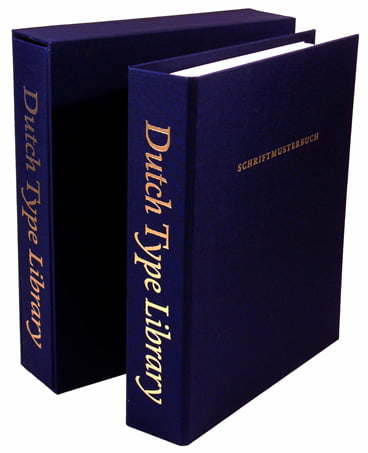
Loose-leaf dtl type specimen


dtl Albertina


dtl Antares
dtl Argo
dtl Caspari


dtl Caspari News


dtl Documenta


dtl Documenta
Sans


dtl Dorian


dtl Elzevir


dtl Estuary


dtl Fell


dtl Flamande


dtl Fleischmann


dtl GrosCanon


dtl Haarlemmer


dtl Haarlemmer
Sans


dtl Nobel


dtl Paradox


dtl Porta News


dtl Prokyon


dtl Romulus


dtl Rosart Orn.


dtl Sheldon


dtl Spanish
Canon


dtl Unico
dtl Valiance


dtl VandenKeere
The program of the Dutch Type Library covers the development of new typefaces first and also re-releases and revivals. The initiative for a new dtl font always comes from the Dutch Type Library. Designers are selected on quality and asked to develop a typeface that fits dtl’s philosophy. Most technical development, as well as the expansion of character sets, takes place internally at dtl. Re-releases and revivals are usually developed by the dtl Studio.
A re-release is a typeface that was once marketed but, usually for various reasons, has been available for a (very) short time. dtl Haarlemmer and dtl Albertina are examples of this. The production by Monotype of Haarlemmer was never completed due to the outbreak of the Second World War and only very sporadically –incomplete– matrix cases were sold. Albertina was originally developed in the early 1960s for the Monotype ‘hot metal’ typesetting machine, but was eventually marketed in 1966 for the Monophoto composer. Due to the somewhat poor quality of the Monophoto version and perhaps also due to the limited garnishes (semi-bold and bold variants were missing), Monotype Albertina was not very successful.
A revival is a redrawing of a historical type model that has disappeared from the scene due to changes in typographical preferences or new technology. The production of revivals makes sophisticated typefaces from the past available to today’s typographers. After all, it would be a great pity if the beautiful lead typefaces that Hendrik van den Keere, Christoffel van Dijck, Johann Michael Fleischmann, among others, once made for manual typesetting, were not available in digital format.

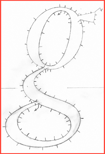
Design drawing with ikarus marking
The fact that many of Jan van Krimpen's typefaces did not survive the transition from mechanical typesetting to phototypesetting and later digital typesetting is probably mainly due to the fact that Van Krimpen’s typefaces were not very successful commercially. However, the quality of Van Krimpen’s œuvre is beyond dispute; that is why the Dutch Type Library makes redrawings of a number of JvK typefaces with the utmost care.
In addition to the already available dtl Haarlemmer, a total of 54 dtl Romulus fonts will be released in the spring of 2024. In the fall of 2024 dtl Sheldon, the bible type that Van Krimpen developed for the Oxford University Press in the first half of the twentieth century, will be brought on the market.
Search | Site index | Contact | Terms of use | Trademarks | Acknowledgements
Last update: 24 November 2024. Copyright © Dutch Type Library, 1998–2024. All rights reserved
dtl Headquarters | Zwaenenstede 49 | 5221 kc ’s-Hertogenbosch | The Netherlands
dtl Studio | Daliënwaerd 71 | 5221 ke ’s-Hertogenbosch | The Netherlands
phone: +31 (0)73 614 95 36 | fax: +31 (0)73 613 98 23 | e-mail: info@dutchtypelibrary.com


